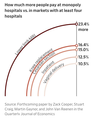
The WSJ usually has decent graphs, but this quarter-pie medical costs chart is a doozy. The vertical line is proportional to the percentages, but tops out at around 25%. (This is from their infographic series on US healthcare costs)
The rest of the graph is a disaster - the area of a circle is proportional to the the square of the radius, so the quarter circle for “Lower limb MRI” is 4 times larger than than the quarter circle for “Vaginal delivery”, even though the actual price increase is only twice is much. This is a classic misuse of comparing area when the units are actually length, and it’s a silly mistake for a national newspaper.
Here’s a simple correction, plotting using matplotlib
import pandas as pd

health_price_data = pd.Series({"Lower limb MRI": .234,
                               "Knee replacement": .164,
                               "Cesarean section": .150,
                               "Inpatient": .125,
                               "Vaginal delivery": .105})

import matplotlib.pyplot as plt

%matplotlib inline

ax = health_price_data.plot.barh(title="Average increase in price for monopoly hospitals, for various services")

_ = ax.set_xticklabels(['{:,.2%}'.format(x) for x in ax.get_xticks()])
ax.set_xlabel("Average price increase of monopoly hospital vs. competitive hospital")

Taking a step back, though, the article is about monopoly power causing higher prices, not that the average markup of a Cesarean section is higher than a standard delivery, so why are we encouraging those types of comparison with the graph anyways?
Instead, we should just emphasize that hospitals with monopoly power, have, on average, higher prices, by some amount, and this doesn’t need a graph.
If we must, the following box and whisker plot will show that we have at least more than one data point.
ax = health_price_data.plot.box(title="Hospital services cost an average of 15% more when there is no competition")
ax.set_ylabel("Increase in price")
ax.xaxis.set_ticks_position('none')
_ = ax.set_yticklabels(['{:,.2%}'.format(x) for x in ax.get_yticks()])
_ = ax.set_xticklabels([''.format(x) for x in ax.get_xticks()])
