I’ve had an interest in personal finances ever since I read Ramit Sethi’s I Will Teach You to Be Rich. There are two steps of personal finance tracking, that can be tackled seperately:
- Data Aggregation - A system that compiles income, spending, and investment returns
- Building goals and actionable steps on top of the data from the previous step
I found that Mint, by Intuit, is the only consumer-grade product that reliably can pull data from various accounts - I think they cover all major financial institutions except Treasury Direct and physical gold storage. I had some success with Plaid before it was determined I was not a fintech company…
That said, I’ve had difficulties with Mint’s goals and actionable steps, driven in part by poor categorization but also by the tricky factor of dealing with reimbursables - either via work, or from friends in venmo.
After trying a couple systems, I gave up and rolled my own in Python and Matplotlib.
First, I connect to Mint to pull data. This can either be done via the unofficial API, or manually from the website. In 2020, Microsoft launched Money with Excel, built on top of Plaid, but I’d prefer to use Python over Excel, currently.
Once the data is pulled into a pandas dataframe, there are two functions I rely on:
def is_income(transaction_description) -> Boolean
    # Categorizes whether the transaction is the result of labor-earned income
    # String matches employers.
    ...


def is_transfer(transaction_description) -> Boolean
    # categorizes whether the transaction is a reshuffling between accounts
    ...
Of the two, is_transfer has more complicated logic, and includes transfer to and from investment accounts while excluding wire transfers, which are usually the result of realizing gains on private investments, not within-account transfers. With income and transfers defined, I define all other transactions as “spending”. This will include some credits, such as expense reimbursements or venmo income. The basic idea here is that these credits are offseting debits from transactions that ocurred earlier.
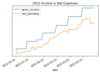
With this categorization, it’s very simple to track income vs. spending, in a graph like the following.
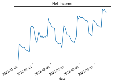
As well as the resulting net income (gross income less spending):
The most actionable data is normalizing income and spending to a daily run-rate. This can then be aggregated to monthly or annual run-rate vs. goals.
It’s also helpful to see the top areas of spending and transactions in each:
top_spending = spending.groupby('category').sum().sort_values('net_amount').index[:5]

for category in top_spending:
    print(f"## {category} ##")
    print(spending[(spending.category == category) & (spending.net_amount < -100)] \
        .sort_values('net_amount')[['date', 'description', 'net_amount']].head(10))

## Restaurants ##
# date                     description     net_amount
# 2022-02-28              LORD STANLEY     -xxx
# 2022-02-01      TST* PORTO - CHICAGO     -yyy
# 2022-02-25     TOCK ATVAULT STEAKHOU     -zzz

# Travel
# ...
I’m really happy with this setup - if I spend more time on, I think I’ll either set it up to run on a schedule, maybe with Netflix’s Papermill, or maybe apply a similar concept for investments, with some sort of IRR calculations and rebalancing proposals.