The popularity of dplyr has led to the use of >%> and an increase in the awareness of functional programming in R. This is great, as side-effectful statements has long been one of my greatest causes of error. Errors are scary, and it’s halloween, so here’s a quick example of >%> for dplyr and ggplot, using M&M data from the University of Puget Sound’s Data Hoard. Although the dev version includes some new operators, this post covers only the standard %>% operator, which can be summarized as ` x %>% f == f(x)`
First, we load the data and produce a quick summary table by type of m&m. The >%> operator isn’t necessary here but helps keep the code structured and readable.
library(reshape2) # http://bit.ly/1x2OEv5
library(magrittr) # ceci n'est pas un pipe
suppressPackageStartupMessages(library(dplyr))
library(ggplot2)
mms <- read.csv('http://stat.pugetsound.edu/hoard/datasets/mms.csv')
mms %>% summary
##             type        color        diameter         mass
##  peanut       :153   blue  :142   Min.   :11.2   Min.   :0.72
##  peanut butter:201   brown :151   1st Qu.:13.2   1st Qu.:0.86
##  plain        :462   green :153   Median :13.6   Median :0.92
##                      orange:128   Mean   :14.2   Mean   :1.42
##                      red   : 99   3rd Qu.:15.3   3rd Qu.:1.93
##                      yellow:143   Max.   :17.9   Max.   :3.62
mms %>%
  group_by(type) %>%
  summarise(m_diam = mean(diameter), m_mass = mean(mass))
## Source: local data frame [3 x 3]
##
##            type m_diam m_mass
## 1        peanut  14.77 2.5977
## 2 peanut butter  15.77 1.7981
## 3         plain  13.28 0.8648
mms %>% melt %>% head # equivalent to head(melt(mms))
## Using type, color as id variables
##            type  color variable value
## 1 peanut butter   blue diameter 16.20
## 2 peanut butter  brown diameter 16.50
## 3 peanut butter orange diameter 15.48
## 4 peanut butter  brown diameter 16.32
## 5 peanut butter yellow diameter 15.59
## 6 peanut butter  brown diameter 17.43
We also might want to investigate size variation by both type and color:
mms  %>%
  group_by(type,color) %>%
  summarise(d=mean(diameter),m=mean(mass),count = n())
## Source: local data frame [18 x 5]
## Groups: type
##
##             type  color     d      m count
## 1         peanut   blue 14.78 2.5759    27
## 2         peanut  brown 14.74 2.5713    23
## 3         peanut  green 15.05 2.6807    27
## 4         peanut orange 14.59 2.5703    29
## 5         peanut    red 15.02 2.6265    20
## 6         peanut yellow 14.53 2.5670    27
## 7  peanut butter   blue 15.87 1.8525    28
## 8  peanut butter  brown 15.68 1.8031    42
## 9  peanut butter  green 16.04 1.9203    34
## 10 peanut butter orange 15.66 1.7300    24
## 11 peanut butter    red 15.77 1.7405    21
## 12 peanut butter yellow 15.66 1.7396    52
## 13         plain   blue 13.22 0.8602    87
## 14         plain  brown 13.30 0.8706    86
## 15         plain  green 13.26 0.8699    92
## 16         plain orange 13.28 0.8648    75
## 17         plain    red 13.28 0.8545    58
## 18         plain yellow 13.37 0.8655    64
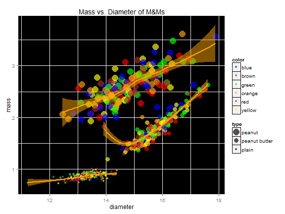
There seems to be more variation in the peanut m&ms. We make a spooky graph to investigate.
Note that >%> works fine inside other functions, and helps keep the code uncluttered from parenthesis.
ggplot(mms,
       aes(x=diameter,
           y=mass,
           size=type,
           colour=color)) +
  scale_color_manual(values =
                       mms$color %>%
                       unique %>%
                       as.character %>% sort) +
  scale_size_manual(values = c(6,4,2)) +
  geom_point(alpha=2/3) +
  stat_smooth(method=loess,fill="orange",alpha=.5,colour="orange",size=1,aes(group=type)) +
  ggtitle("Mass vs. Diameter of M&Ms") +
  theme(legend.key = element_rect(colour = "black")) +
   theme(panel.background = element_rect(fill = "black"))

References: